Q-Q Plot
A Q–Q plot (quantile-quantile plot) is a probability plot, a graphical method for comparing two probability distributions by plotting their quantiles against each other. A point
For example, when using quartiles as the only quantiles, there are only five points on a graph, representing (0%, 25%, 50%, 75%, 100%) respectively.
If the two distributions being compared are similar, the points in the Q–Q plot will approximately lie on the identity line
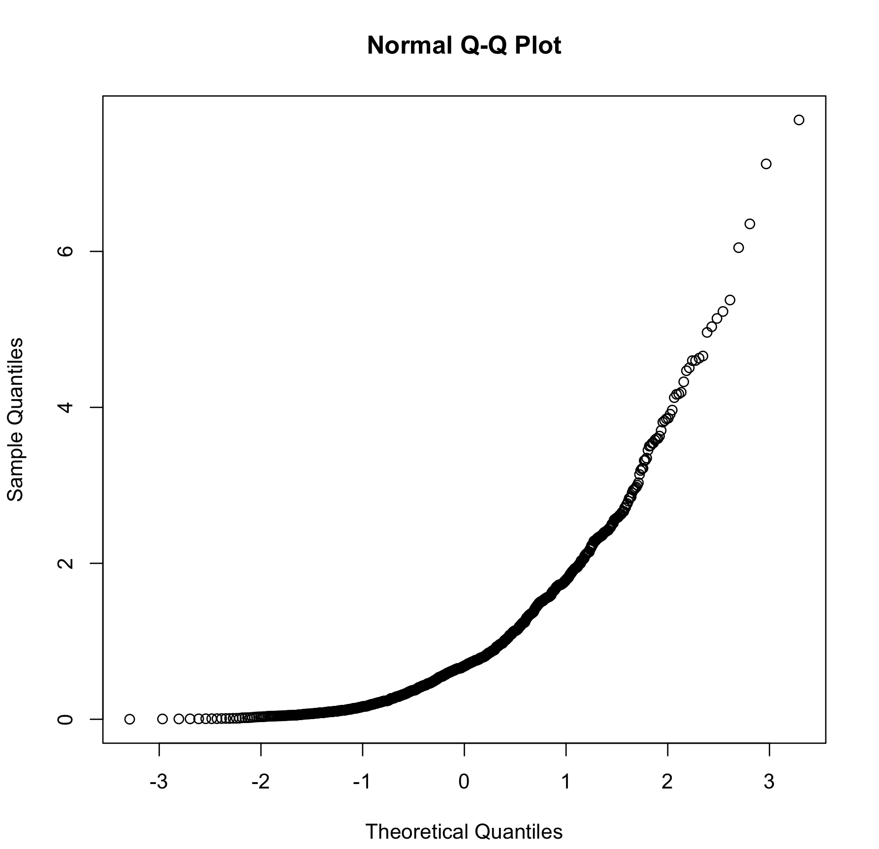
Q–Q plots are commonly used to compare a data set to a theoretical model. For example, collected data and a Normal Distribution.
Q–Q plots can also be used to compare collections of data, which can be viewed as a non-parametric approach to comparing their underlying distributions. A Q–Q plot is generally more diagnostic than comparing the samples' Histograms, but is less widely known.
Since Q–Q plots compare distributions, there is no need for the values to be observed as pairs, as in a scatter plot, or even for the numbers of values in the two groups being compared to be equal.
- Another graphical method to compare distributions is to compare the Density Curves.
Q-Q Line
A Q-Q line is a line connecting the two points at specified quartiles of the two distributions. The default quartiles are the first and the third.
R Plot
x <- rexp(1000, rate = 1) # exponential distribution
# built-in function
qqnorm(x)

# DIY
n <- rnorm(1000) # normal distribution
qx <- quantile(x, probs=seq(0,1,.001))
qn <- quantile(n, probs=seq(0,1,.001))
plot(qn,qx)
 by zcysxy