Choropleth
A choropleth map is a type of Heatmap with units using political boundaries.
In a choropleth, colors usually correspond with an aggregate summary of a geographic characteristic within spatial enumeration units, such as population density or per-capita income.

Compared to Heatmap, choropleths have an additional variable for each unit, that is area (and shape).
Also, we can think of the choice of the political boundary as a meta-variable; just like in heatmaps, we can use hexagons or squares.
But for choropleths, choosing an appropriate political boundary is more important; it should be determined by the nature of the data.
Land Area Problem
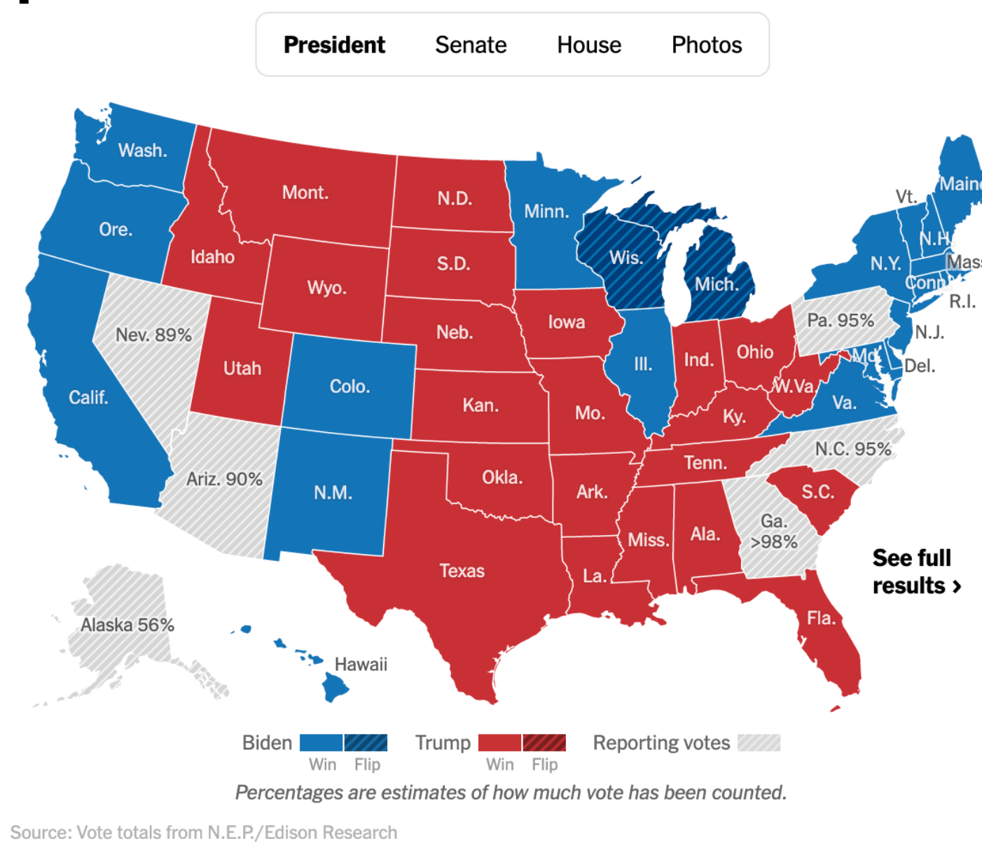
A serious problem with choropleths is that if the data has an "absolute" value (not relative to the area), the choropleth can be misleading. For example, the election results always show a larger red area than blue, even though more people voted for Democrats.
There are several attempts to alleviate this problem.
Cartogram
A cartogram distorts the area of regions in order to convey the information of an alternate variable. The region area will be inflated or deflated according to the numeric value of that variable.
Note that the variable determining the distortion and the variable determining the color are not necessarily the same. Actually, there would be redundancy if they were the same one.
For example, we can use color to present the election result, and distort the cartogram according to the number of voters.
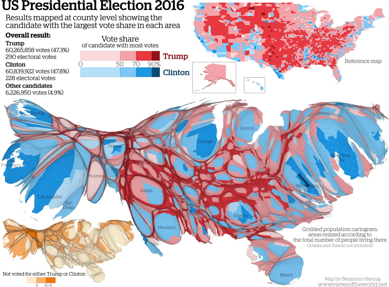
Although the graph clarifies the possible misconception that "most people voted for Trump", it makes the map almost unreadable. Two ways to address this problem
- Use animation to animate the distortion process
- Only distort a part of the map while keeping other regions unchanged
Both methods keep a reference to the unchanged map, with which we can compare the distorted map.
Uniform Area
Another approach is to give each region the same area and shape. This eliminates the area and shape variable unique to choropleths, thus reducing them to general Heatmaps.
Also, this approach doesn't convey additional information of an alternate variable like #Cartograms. Therefore, this approach "hides" the problem rather than addresses it.
Combination with Other Graphs
Spatial and Temporal
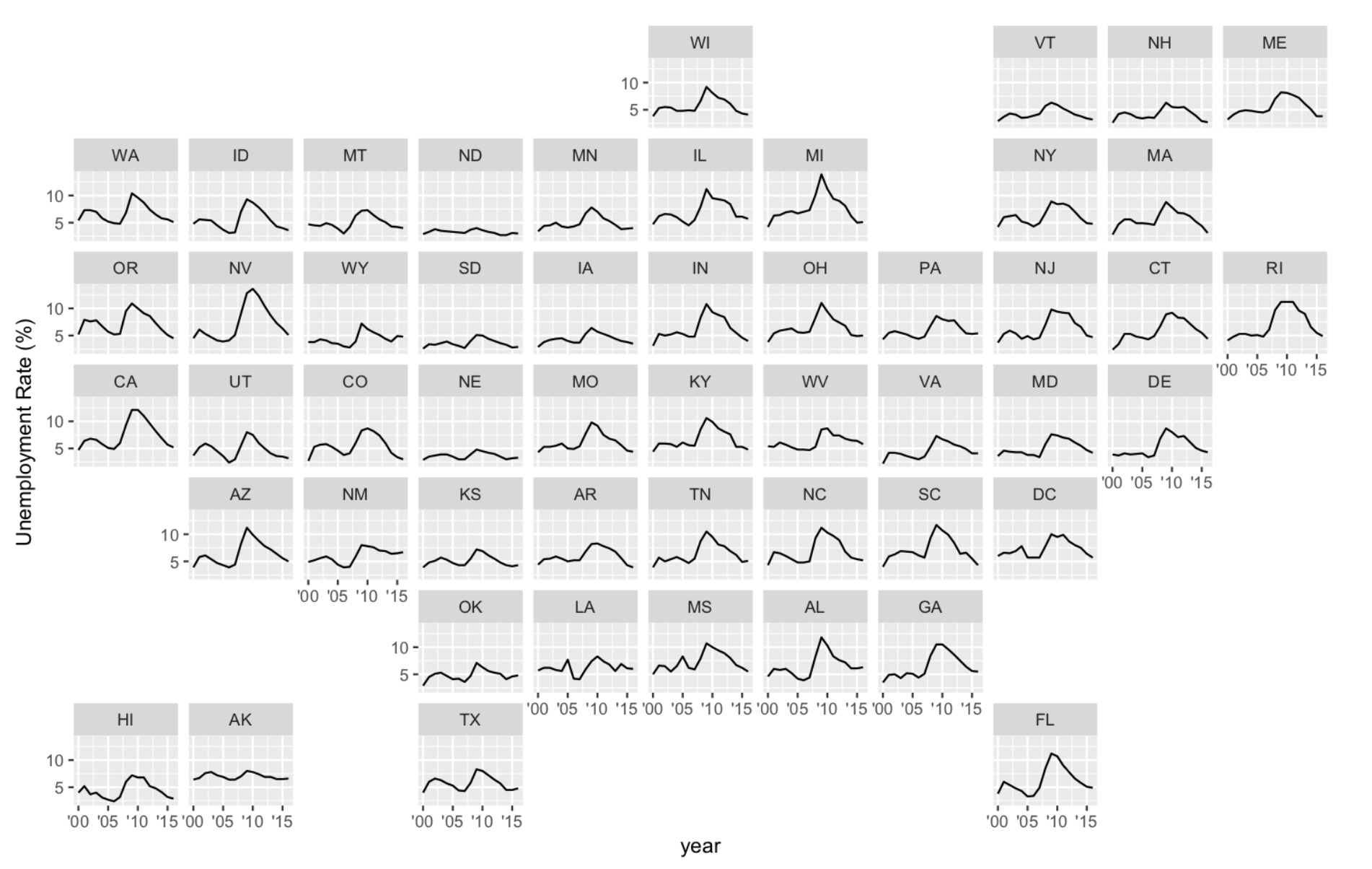
It is common that we need to combine spatial and temporal data. To this end, we can use facets. We can either
-
facet on time
- then each facet is a choropleth
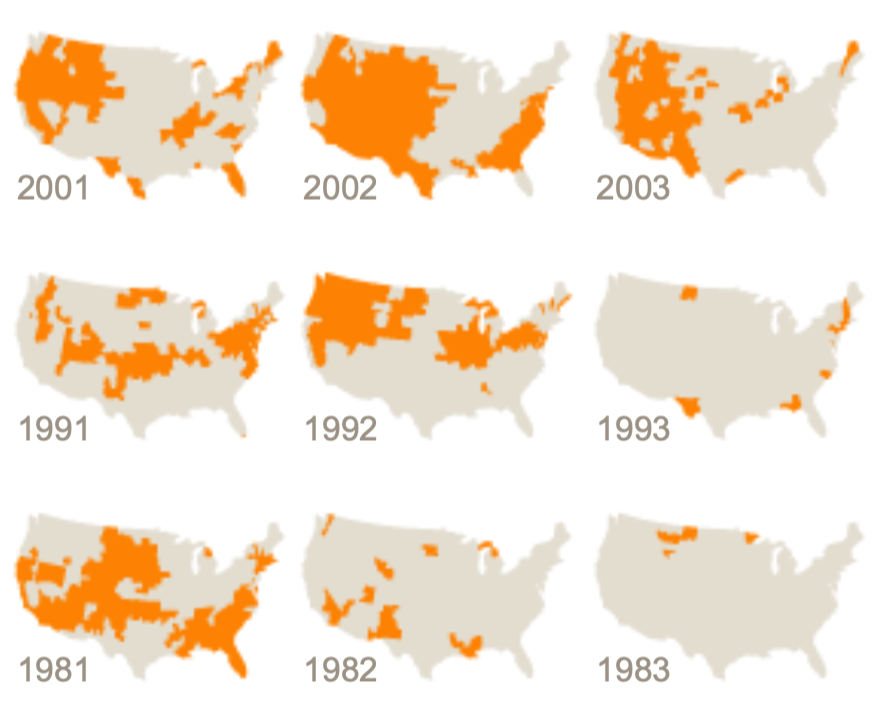
-
facet on space
- then each facet can be any plot presenting the temporal data
- and the facets are laid out in a grid that mimics the original geographic topology
- this technique is also called geofacet
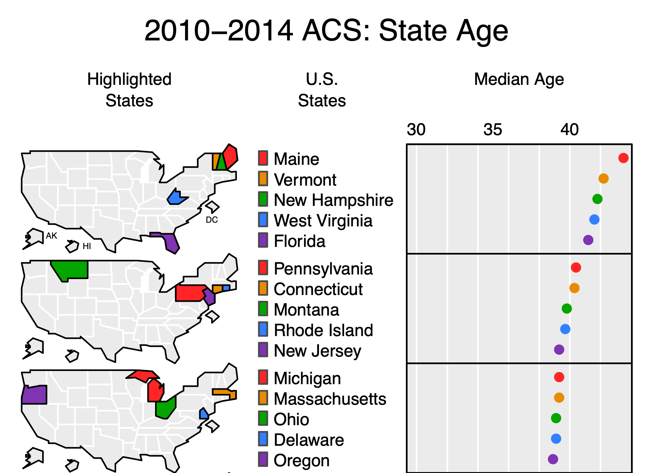
Linked Micromaps
We can also use choropleths as a legend for other plots to tell where places are. These graphs are called linked micromaps. The following example is for a Cleveland Dot Plot
Implementation
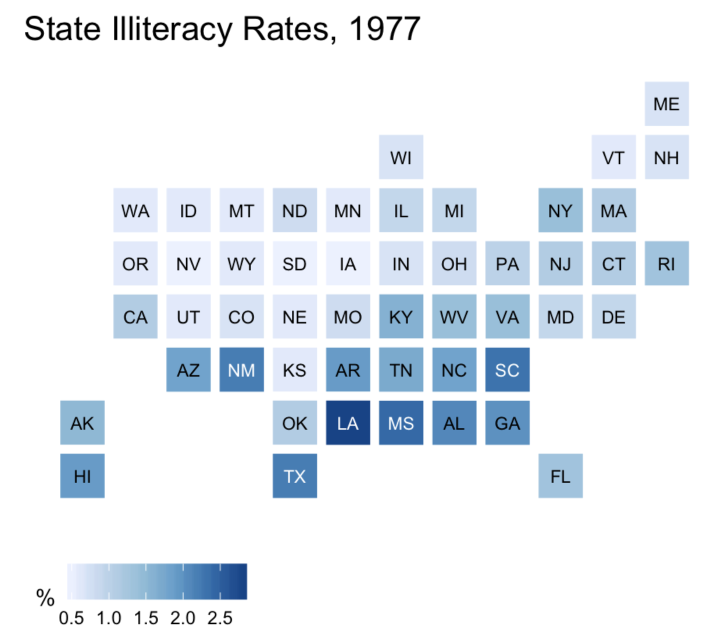
choroplethr
Package choroplethr is capable of drawing state and county level maps without using shape files. The data frame must contain region and value columns, and the values of region should be recognizable by choroplethr (for example, they should be lowercase). Related functions:
state_choropleth()county_choropleth()- This function creates a US map at county level; to zoom into a state, use option
county_zoom
- This function creates a US map at county level; to zoom into a state, use option
library(dplyr)
library(tidyr)
library(tibble)
library(ggplot2)
library(choroplethr)

# data frame must contain "region" and "value" columns

df_illiteracy <- state.x77 %>% as.data.frame() %>%
  rownames_to_column("state") %>%
  transmute(region = tolower(`state`), value = Illiteracy)

p <- state_choropleth(df_illiteracy,
                 title = "State Illiteracy Rates, 1977",
                 legend = "Percent Illiterate")
plot(p)
sf and tmap
 by zcysxy