Categorical Data
Categorical data is a type of data that can be divided into groups or categories.
Graphs
- Bar Chart
- since the bars in a Bar Chart always have the same width, you compare lengths, not areas, which is much easier
- Pie Chart
- Cleveland Dot Plot
There are suggestions for using individual points (not the same as Cleveland Dot Plot) for cases and jittering to keep them apart. This does not work well for high-frequency groups, as it is hard to assess their densities, and the displays for low-frequency groups may exhibit non-existent patterns due to the random jittering.
Nevertheless, as always with exploratory graphics, if a graphic helps to uncover information, it is worth using.
Ordinal vs Nominal
Nominal Scale and Ordinal Scale are two typical categorical variable measurement scales.
- Nominal Scale is derived from the Latin word "nomalis" which denotes "related to names". Variables of nominal scale have names, but usually do not have a natural order
- gender, race
- Ordinal Scale involves arranging information in a specific order
- rank, age
Discrete Data
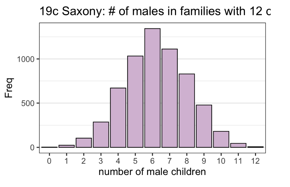
Though not strictly categorical, when a variable has discrete values and the range is small, we can regard it as a categorical variable.
In this case, a Bar Chart is the same as a Histogram if each bin in the histogram contains only one value.
Features
- Unexpected patterns
- There may be many more of some categories than others
- Some categories may be missing completely
- Uneven distributions
- Observational studies may exhibit some form of bias
- too many males
- In medical meta-analyses, many trials are analyzed together, although it can turn out that most of the trials were small and that the results are dominated by one or two major trials
- Observational studies may exhibit some form of bias
- Extra categories
- Gender may be recorded as ‘M’ and ‘F’, but also as ‘m’ and ‘f’, ‘male’ and ‘female’
- In a study of patients with two medical conditions, there may be some patients diagnosed with a third condition
- Unbalanced experiments
- Although experiments are usually carefully designed and carried out, there is always the chance that some data are missing or unusable
- It is important to know if this occurs and leads to unequal group sizes
- Large numbers of categories
- Don’t knows, refusals, errors, missings, ...
- Data may not be available for a wide variety of reasons, and plots summarising how many cases of each type have arisen can be helpful both in deciding how to handle the data and in properly qualifying the results from the data that are available
- Opinion polls
Facets
Sometimes categories can be further divided into different groups, with different scales. We can use facets w/ different scales if needed. See ggplot2#^32e6e9 for code. However usually, we should not use different scales in a plot.
Top/Bottom-Coded Data
When there are too many categories to present, we can combine top/bottom categories into a "or more" category. However, the "or more" category may contain too much data to be considered "or more". So when a smart cut is needed. For example, when two bars are similar, it's not reasonable to cut them; you should look for a "jump" instead.
Data Formats
- cases
- w/o counts
- counts (
Freq) - contingency/pivot table
- Ex:
        Favorite
  Age     bubble gum  coffee
    old   2           4
    young 7           1
- Ex:
Conversions:
| From \ To | cases | counts | table |
|---|---|---|---|
| cases | - | as.data.frame(table()) or group_by() %>% summarise(Freq = n()) |
table() |
| counts | link | - | xtabs() |
| table | link | as.data.frame() |
- |
Likert Data
Likert data is a special categorical data that uses a psychometric scale commonly involved in questionnaires. For example
- strongly agree
- agree
- don’t know
- disagree
- strongly disagree
Relative frequency stacked Bar Charts are used to present this kind of data.
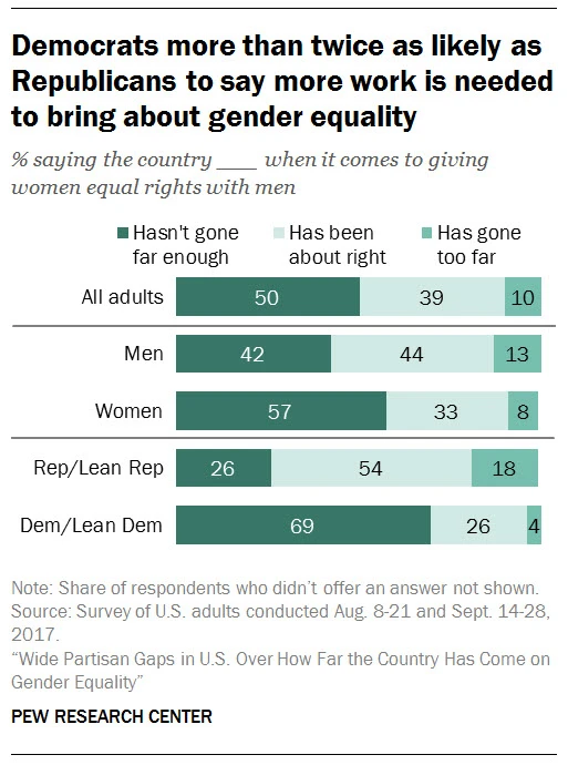
Colors play an important role in presenting this kind of data: we use a neutral color to present a neutral category, and use two different sets of colors for categories on two sides.
Another type of Bar Chart, diverging stacked bar charts, sometimes are more suitable. They align bars with the neutral category always in the center. By doing this, the inclination stands out.
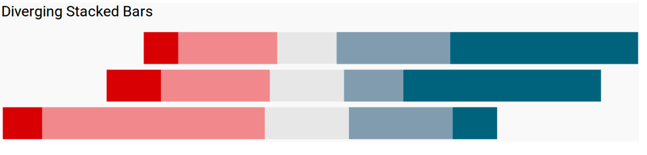
Furthermore, we can separate and even remove the neutral category.
Combine Continuous Variables and Categorical Variables
When combining Continuous Variables and Categorical Variables, we should consider
- mapping options:
- Continuous: x-axis, y-axis, color (not so great), size (not so great)
- Categorical: color, facets (rows, columns), shape (maybe)
- Add one variable at a time
- Create more graphs if suitable options run out
- Switch options to test
 by zcysxy