Bar Chart
A bar chart is a chart or graph that presents EDAV - Categorical Data with rectangular bars with heights or lengths proportional to the values that they represent. The bars can be plotted vertically or horizontally. A vertical bar chart is sometimes called a column chart.
One axis of the chart shows the specific categories being compared, and the other axis represents a measured value.
Some bar graphs present bars clustered in groups of more than one, showing the values of more than one measured variable.
- For unbinned data, use
geom_barin ggplot2 - For binned data, use
geom_colin ggplot2 - We can use
geom_textto put labels directly in/on bars - Do not color bars when it is not necessary. Colors are needed #For Multivariate Categorical Data.
Ordering
There are two typical scales of a categorical variable.
For ordinal data, sort bars in the logical order of the categories. For example, novice -> advanced -> expert.
You can sort in either direction top <-> bottom, or left -> right).
For nomial data, sort bars from highest to lowest (top -> bottom, left -> right).
Rebinning
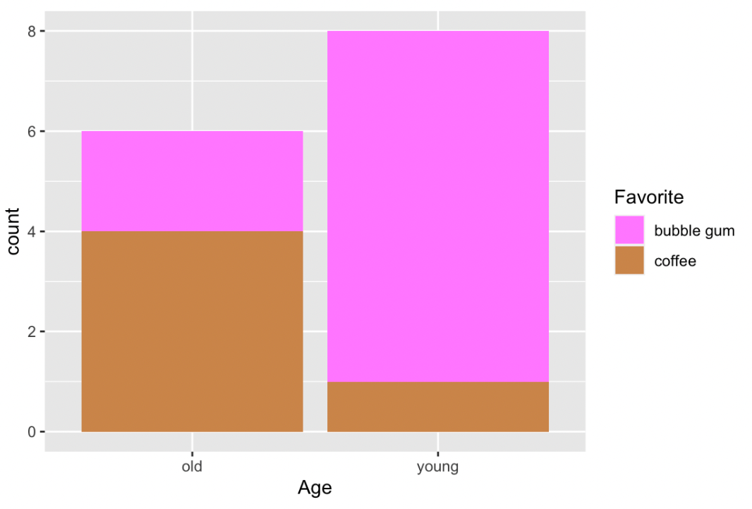
When plotting bar plots, rows of different categories in the same category are automatically stacked up.
However, when coloring, stacked bars are colored separately.
To bin the data by hand, we can use dplyr#summarise() with group_by(category).
df %>%
  group_by(Class) %>%
  summarize(Freq = sum(Freq)) %>%
  ggplot(aes(fct_reorder(Class, Freq, .desc = TRUE), Freq)) +
  geom_col() +
  xlab("")
For Multivariate Categorical Data
For Multivariate Categorical Data, instead of drawing multiple bar charts (possible with facets), we can put bars for different categories together by
- Stacked Bar Chart
- Better for the overall value
- Grouped Bar Chart
- Better for the individual value
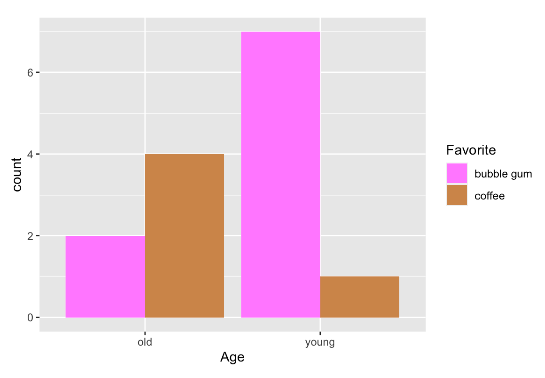
- Grouped bar charts are less used but more recommended
Relative Frequency and Diverging Stacked Bar Chart
Likert Data
Likert data is a special categorical data that uses a psychometric scale commonly involved in questionnaires. For example
- strongly agree
- agree
- don’t know
- disagree
- strongly disagree
Relative frequency stacked Bar Charts are used to present this kind of data.
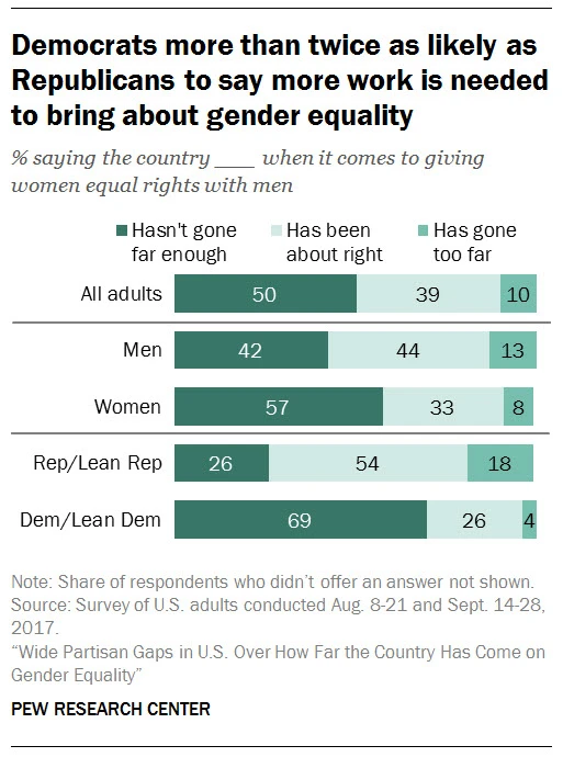
Colors play an important role in presenting this kind of data: we use a neutral color to present a neutral category, and use two different sets of colors for categories on two sides.
Another type of Bar Chart, diverging stacked bar charts, sometimes are more suitable. They align bars with the neutral category always in the center. By doing this, the inclination stands out. ^99cd33
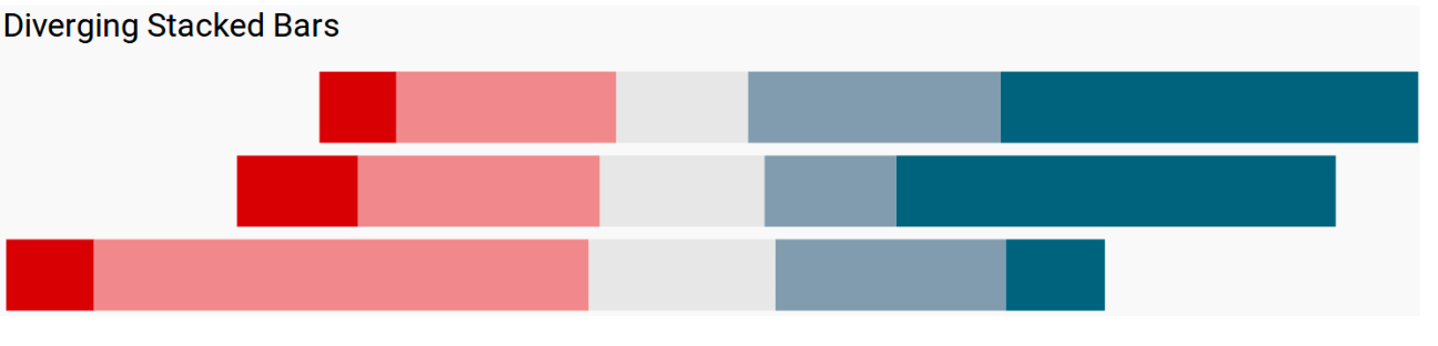
Furthermore, we can separate and even remove the neutral category.
 by zcysxy