Time Series
A time series is a sequence of data points, typically consisting of successive measurements made over a time interval. Visualizing time series data helps extract meaningful statistics and other characteristics of the data.
- When presenting time series data, use lines with time on the x-axis
- Use
DateandDate-TimeR classes for time series
Long-Term Trend
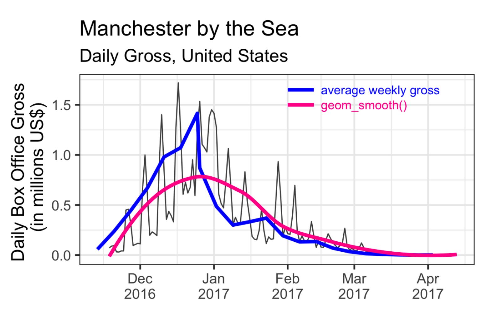
Time series graphs are good for exploring overall long-term trends (secular).
Time series are essentially discrete data and have short-term noise. We can add a loess smoother to fit the data.
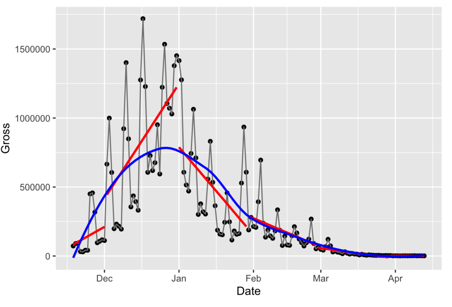
In the above example, the blue curve is a global non-parametric smoother, while the red segments are linear smoothers constrained to specific time windows (groups). We can see that the smoothers eliminate the short-term noise (e.g. intra-weekly oscillations) and present the long-term trend.
Add a smoother using ggplot2: geom_smooth(method = "loess", span = .75, se = FALSE)
- Choose the right parameters for smoothers to avoid Overfitting and Underfitting. Small
spantends to overfit; while largespantends to underfit.
{ #4j85jk}
A rolling average and a smoother are alike, but they are not the same thing. A rolling average is fitting a constant instead of a line. Therefore, there are more jumps in a rolling average. Rolling averages only aggregate the previous information and do not capture future information.
Remove Cyclical Trends
In addition to smoothers, there are some other methods to eliminate the noise of short-term cyclical trends. The key idea is to extract a certain point in the cycle, and show the trend of this point among all cycles. For example, when there is a weekly cyclical trend, we can focus on the trend of Monday data. To achieve this, we can
- Highlight/label Monday data points
- Facet by weekdays
- Use special functions like
monthplot
Abnormalities
Abnormalities and outliers may violate the trend. To find the abnormalities, we can
- Use another feature/variable, which may be the cause of abnormalities, to label the data
- Highlight the abnormality
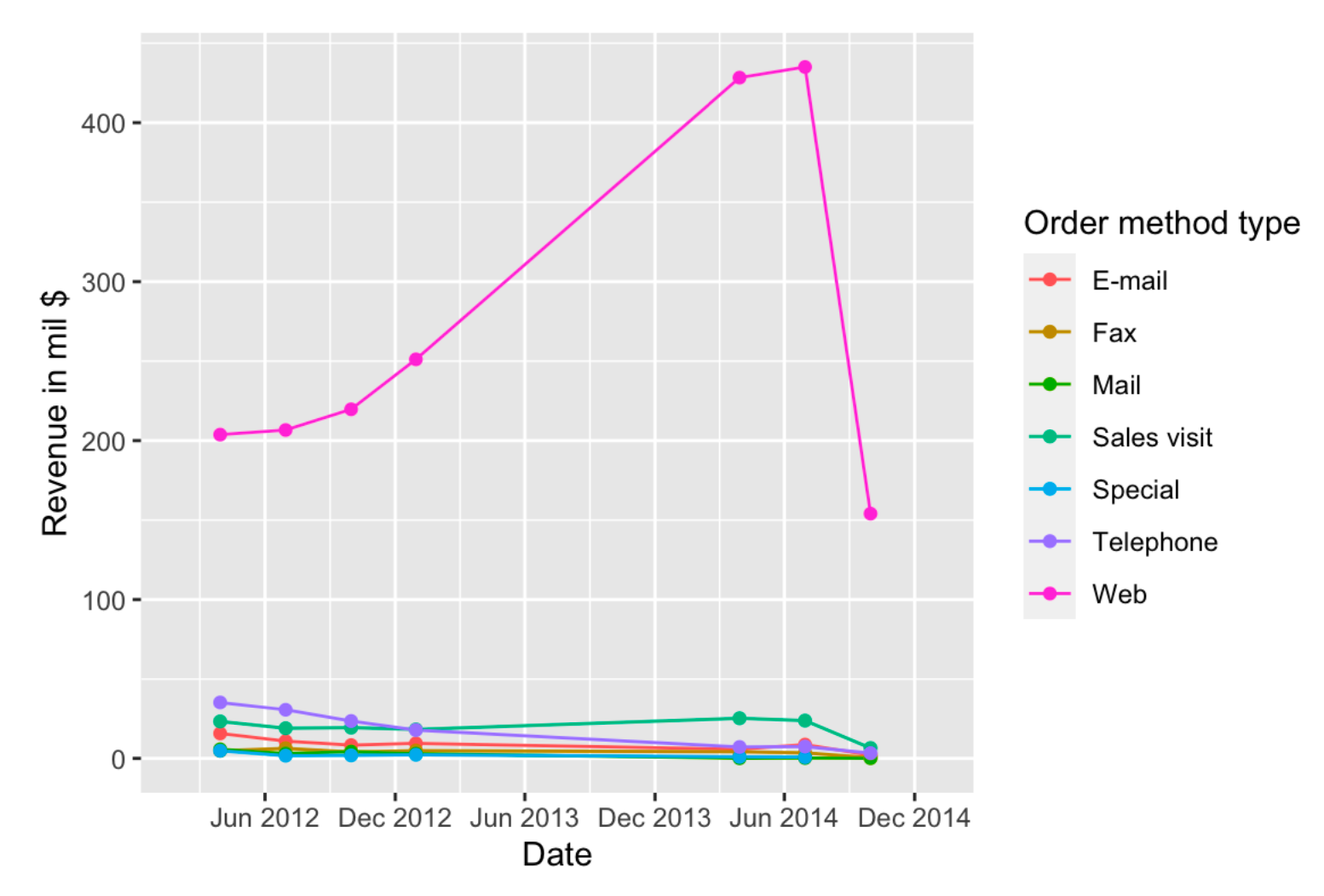
Compare Multiple Lines
When using raw data to plot a multi-line plot, some lines will dominate others. To only compare the trends instead of values, we can scale the data using
Gaps
Line plots do not show the frequency of the data, and may hide gaps. We can add additional points to show the frequency.
To explicitly show the gap, we can set missing values to NA (do not remove them).
Another option is to use facets.
 by zcysxy