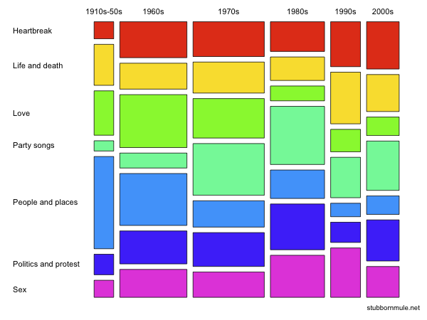
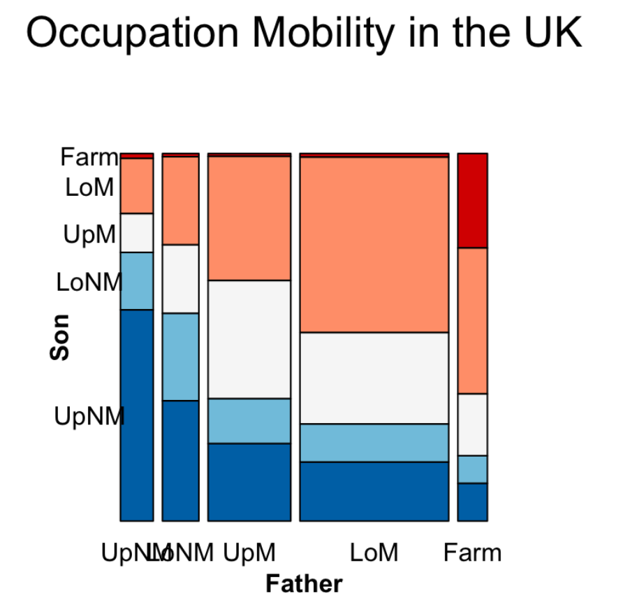
Mosaic Plot
A mosaic plot is a filled rectangular plot (no white space) with consistent numbers of rows and columns, in which the area of each small rectangle is proportional to the frequency count for a unique combination of levels of the categorical variables displayed.
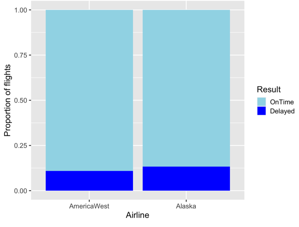
- Mosaic plots are like stacked Bar Charts, except that the width and height of the bars are proportional to the amount of data.
- Mosaic plots are not treemaps, which are another type of filled rectangular plots representing hierarchical data (fill color does not necessarily represent frequency count)
- Mosaic plots with only one horizontal cut (variable) are called spine plots, where vertical cuts are called spines
- Mosaic plots with the same bin width are relative frequency stacked Bar Charts
- All bars sum up to 100%, thus have the same height
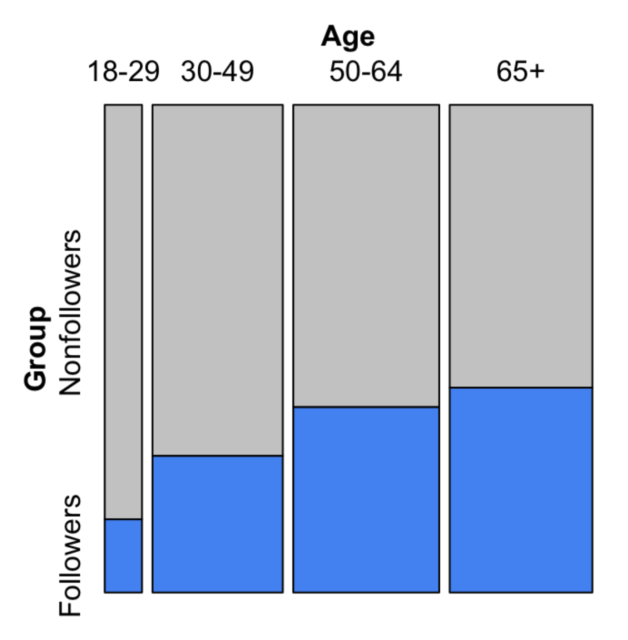
You can not read the actual values in a mosaic plot, but you can inspect the association. As we can see from the above example, we can relatively confident in concluding that the older one is, the higher probability of them being a follower.
The steeper the stairs, the stronger the relationship.
More Variables
Mosaic plots are powerful for presenting Multivariate Categorical Data. We can put multiple variables on the x-axis and y-axis. The most important problem is cutting the variables.
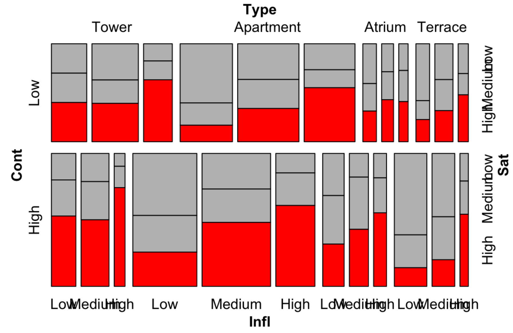
As in the above example, we put variables
InflandTypeon the x-axis- We first cut on
Type, and in eachType, we cut onInfl
- We first cut on
ContandSaton the y-axis- We first cut on
Cont, and in eachCont, we cut onSat
- We first cut on
Mosaic Pairs Plot
Just like Scatterplot Matrix, we can make mosaic plot matrix, with each element being a spine plot with two variables. Then for
Best Practices
- The order of cuts
- Split dependent variables last
- Direction of cuts
- Split dependent variables horizontally
- 3 vars: VVH
- 4 vars: VVVH
- 5 vars: VHVVH
- Color fill is set to a dependent variable
- Use color to stress the relationship
 vs.
vs. 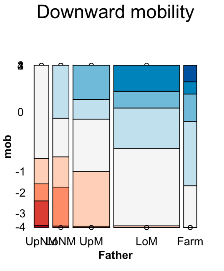
- Use color to stress the relationship
- The most important level of the dependent variable is the closest to the x-axis and with the most noticeable shade
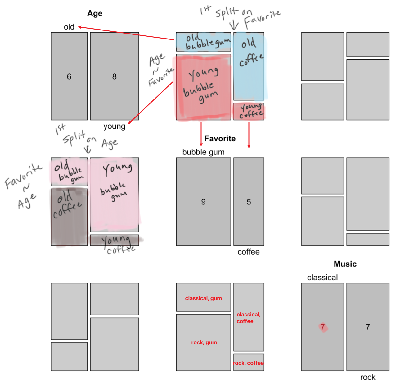
Implementation
geom_mosaicin ggplot2mosaic()in packagevcd-
mosaic(Music ~ Age, data = counts3, direction = c("v", "h")) -
mosaic(Music ~ Age + Favorite, data = counts3, direction = c("v", "v", "h")) -
Here R Type - Formula can be read as "on", especially for dependent variables
-
There should be a
Freqcolumn in the date, which is a standard column in a dataframe -
use
vcd::labelingsfunctions to- abbreviate labels using option
abbreviate_labs = c(FALSE, 3, 6) - rotate labels using option
rot_labels = c(0,0,0,0) - adjust variable names using option
set_varnames = c('name1', 'name2')
- abbreviate labels using option
-
use
vcd::spacingsfunctions to adjust the spacing between factor levels
-
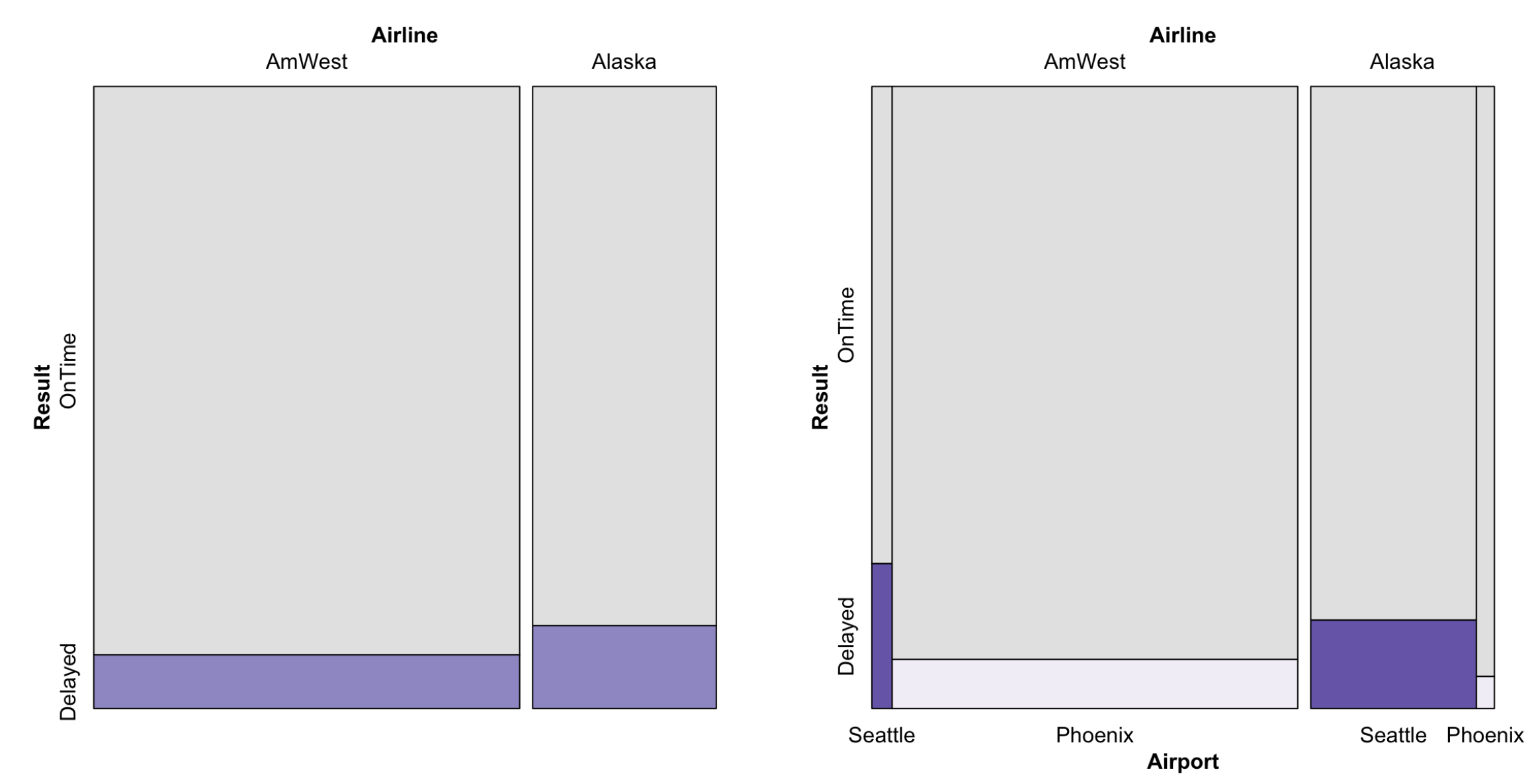
Simpson's Paradox
Simpson's paradox is a phenomenon in Probability Theory and Statistics in which a trend appears in several groups of data but disappears or reverses when the groups are combined.
An example of Simpson's paradox is A Plausible Treatment Test.
A visual example of Simpson's paradox:
 ==>
==> 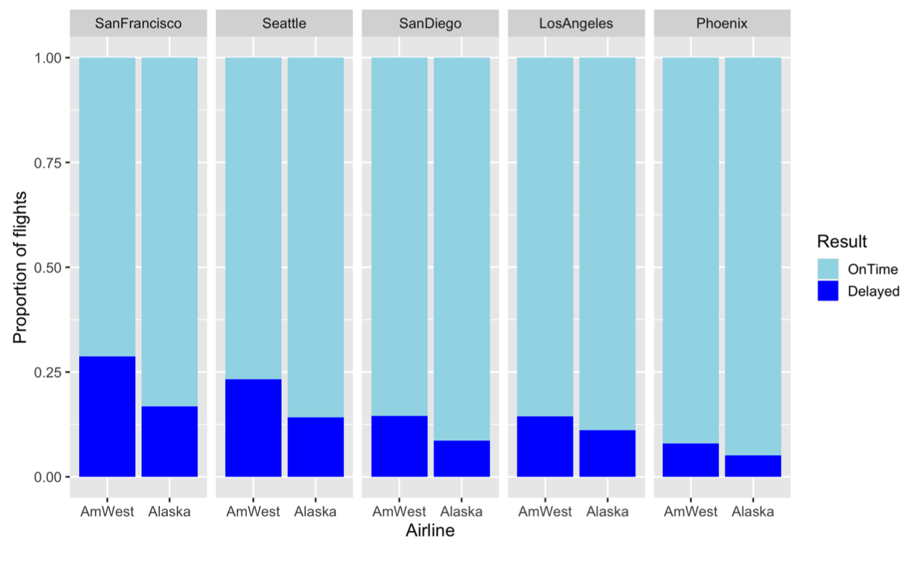
Mosaic plots can help eliminate Simpson's paradox:
 by zcysxy