Developer Tools
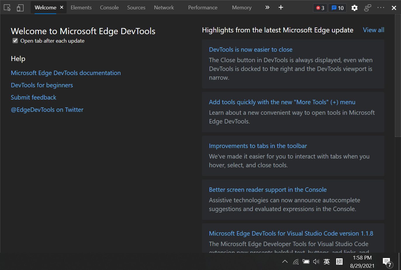
- [c] DevTools of Microsoft Edge
DevTools is a set of web developer tools built directly into the browser.
DevTools is available on major browsers like Chrome, Edge, and Safari.
Open the DevTools
Applications
For useful applications, see the Application section.
Console
This panel is related to JavaScript
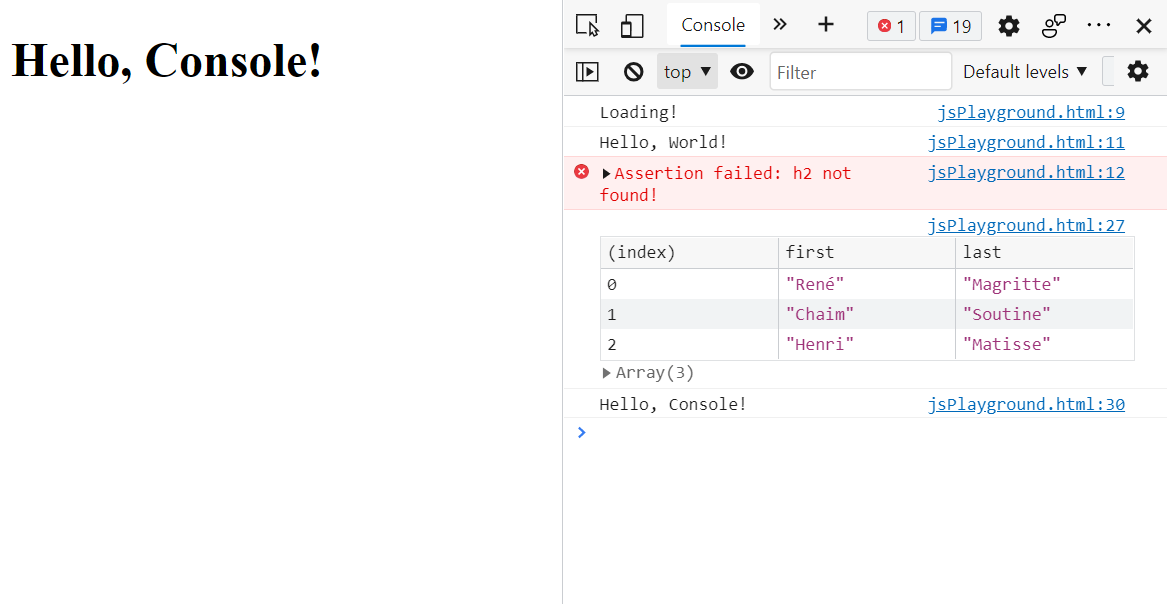
- Messages generated by
console.log()function will be logged to Console - The Console is also a REPL: you can run JavaScript in the Console to interact with the page that you're inspecting
- You can open Console in the Drawer
- Drawer is a pane at the bottom of the DevTools that can be opened and closed by
Esc - Therefore you can access Console in any tab
- Drawer is a pane at the bottom of the DevTools that can be opened and closed by
- In Console, you can reference the currently-selected node with
$0- When you inspect a node, the
== $0text will appear next to the node
- When you inspect a node, the
Source
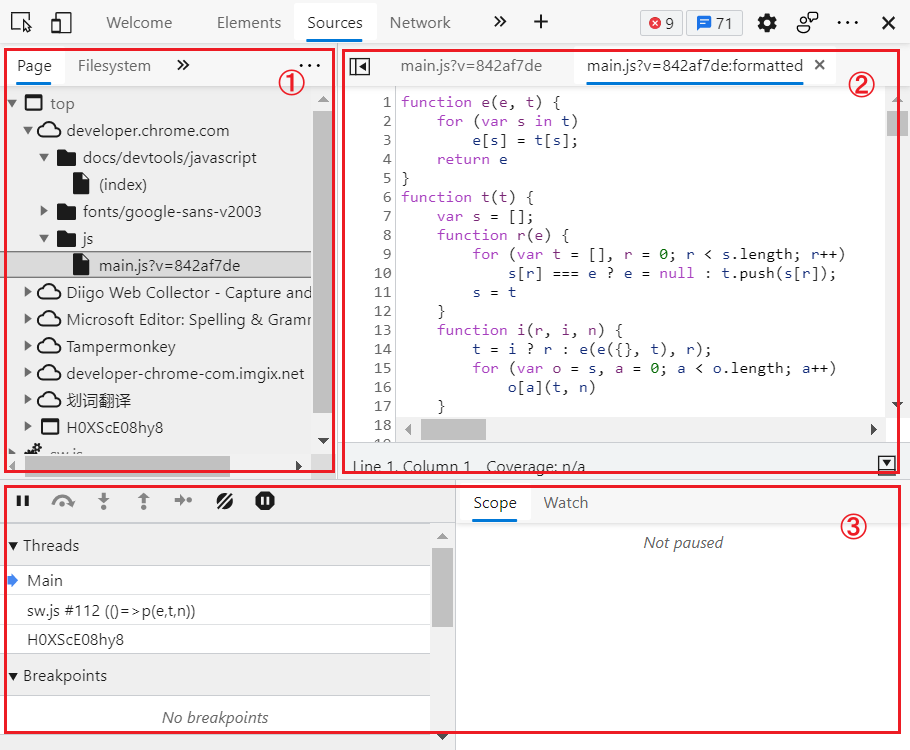
The Source panel is like a lightweight IDE where you can debug JavaScript. It consists of three panes
- File Navigator
- Code Editor
- JavaScript Debugging
Impt
For the full Debug JavaScript - Chrome Developers
Elements
- This panel is related to HTML and CSS
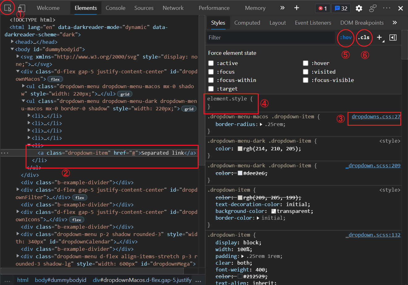
- On the left top corner, there is a inspect button for you to select any HTML Element in the page
① - The main pane shows the DOM of the page
②- You can directly edit its HTML source code there
- You can also drag the nodes to reorder them
- You can use the keyboard to navigate in the DOM
- You can right click on a node and click
Scroll into viewto sync it with the viewport - You can find any node by
Ctrl + F - You can hide a node by selecting it and pressing
H
- You can directly edit its HTML source code there
- Choose an HTML Element, all its CSS styles appear in the
Stylesside pane- All styles including inline CSS
- The source of every set of rules will appear in the right top corner
③ - You can insert, edit, enable, and disable any rules
- You can add inline CSS rules in the top
element style④ - You can toggle element's states through the
:hovbutton⑤ - You can add classes to the element through the
.clsbutton⑥
- And the
Computedside pane will show all the rules applied to the element- "computed" means rules link
inheritandinitialwill be replaced by the computed values - Click on each rule so you can see the uncomputed value and source, and go to the original rule set
- Check
Show allto show all the rules the element implicitly inherits - Check
Groupto group rules into different categories
- "computed" means rules link
- Both in
StylesandComputedtabs, there is a box model diagram showing the element's size, padding, border, and margin- You can directly edit these properties by double clicking the values
Coverage
The Coverage tab shows you what CSS a page actually uses.
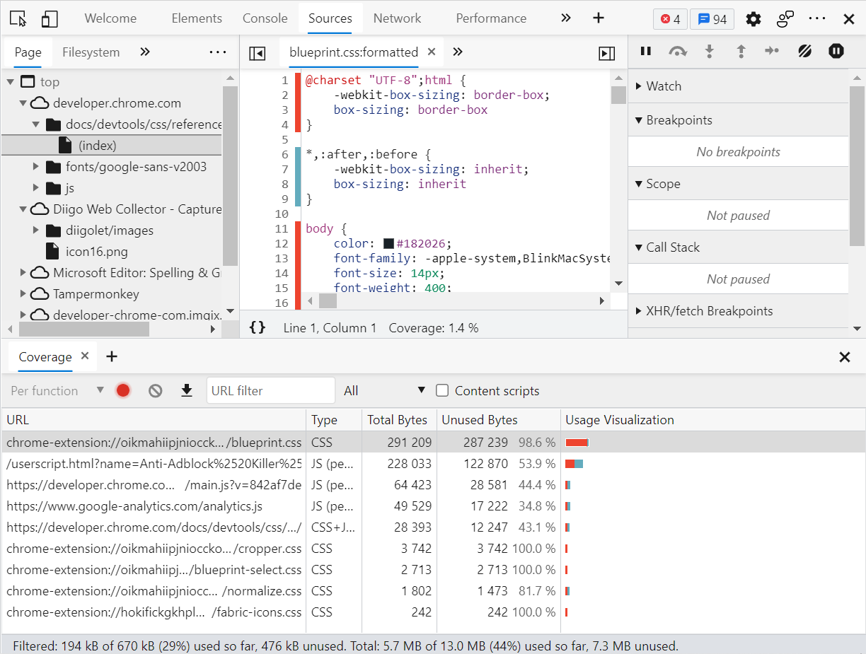
- In Command Menu run the Show Coverage command to enable the
Coveragetab - Click the
Refreshbutton (at the position of the red dot in the above figure) to reload the page and see the coverage info - Teal represents the used proportion; Red represents the unused proportion
- Click any file (URL) to see a line-by-line breakdown of what code it uses
- #E In the above figure, CSS rules from lines 6 to 9 are applied, while other rules in the figure are not applied
Command Menu
In DevTools, there is a feature called the command menu that is similar to the **command palette in VSCode.
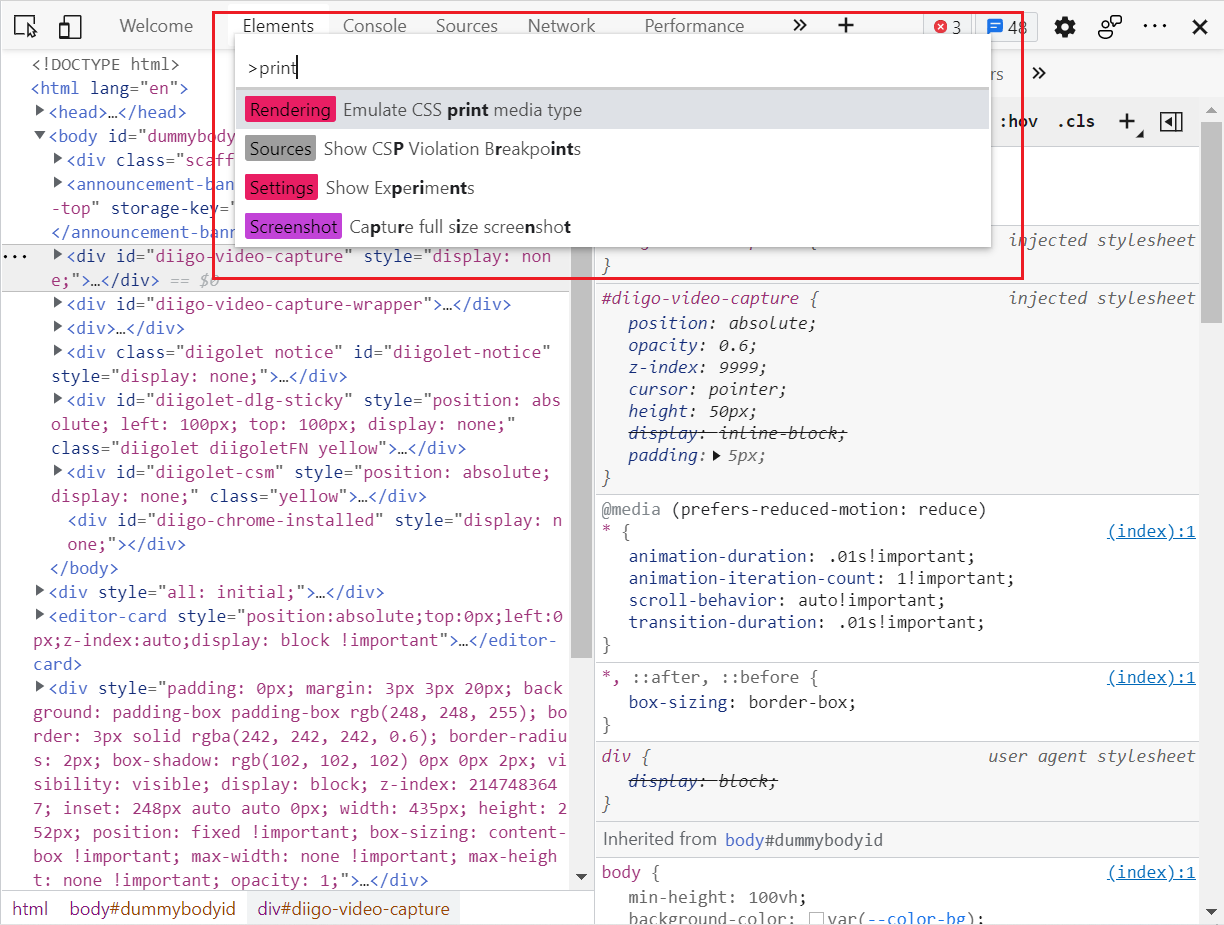
Ctrl + Shift + Pto open the command menu when DevTools is focused- Prompt
>means "run command", there are other prompts for other actions- No prompt: open file
@: go to symbol:: go to line!: run snippet
Application
Print Mode
To view a page in print mode:
- Open the Command Menu
- Run command
Emulate CSS print media type- Or start typing
Renderingand selectShow Rendering - For the Emulate CSS Media dropdown, select print
- Or start typing
Device Mode
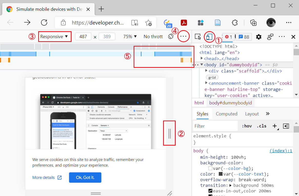
- Click button
①to open the UI that enables you to simulate a mobile viewport - By default, the Device Toolbar opens in Responsive Viewport Mode
②- You can change to other modes from the device list
③ - To show media query breakpoints above your viewport, click More options and then select Show media queries
- You can change to other modes from the device list
- You can show CSS Media Querys
⑤in the more options menu④- Click a media query breakpoint to change the viewport's width so that the breakpoint gets triggered
Tip
For the complete reference see Simulate mobile devices with Device Mode - Chrome Developers
 by zcysxy